Browse by Topic
Popular
Popular Posts
Latest
Latest Python Posts
Python Openpyxl: Create, Load, Read, Write Excel Files
Use Python openpyxl to create, load, read, and write .xlsx files without Excel. This guide covers workbooks, sheets, cells, formulas, formatting, and modes for large files.
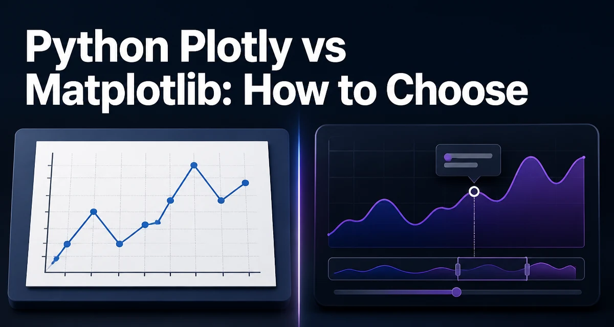
Plotly vs Matplotlib in Python: How to Choose
Choosing between Plotly and Matplotlib for Python data visualization depends on your use case. This comparison covers API style, interactivity, output formats, performance, and Pandas integration.
Python Plotly: Save HTML and Export Images
Save Plotly figures as interactive HTML files and export static images in Python using write_html, write_image, and kaleido.
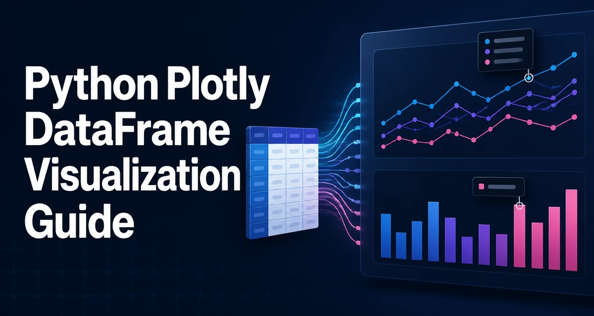
Python Plotly DataFrame Visualization Guide
Create interactive visualizations directly from pandas DataFrames with Plotly Express and graph_objects. Covers line charts, scatter plots, bar charts, time series, performance, and layout customization.
Python Plotly Heatmap and 3D Charts
python plotly heatmap and 3d charts: Learn to create interactive heatmaps and 3D charts with Python Plotly, covering plotly express, graph_objects, customization, and...
Python Plotly Graph Objects: Multiple Traces and Subplots
python plotly graph objects multiple traces and subplots: Learn how to build complex figures with multiple traces and subplots using Plotly graph objects in Python, in...
Python Plotly Interactive Charts: Hover and Custom Data
Control Plotly hover tooltips in Python and attach extra fields with hover_data, customdata, and hovertemplate.
Python Plotly Express: Line, Bar, Scatter, Pie, Histogram
Learn how to create line, bar, scatter, pie, and histogram charts with Python Plotly Express, including data mapping, key parameters, and customization.
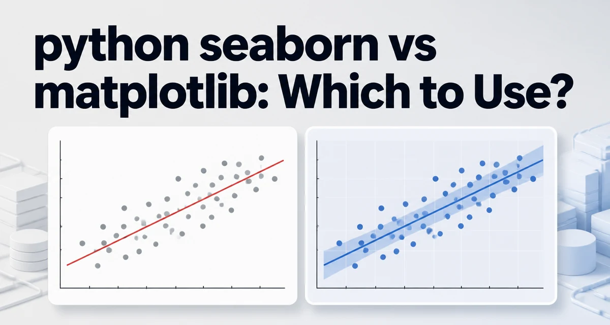
Seaborn vs Matplotlib in Python: Which Should You Use?
Compare Seaborn and Matplotlib for Python data visualization. Learn the key API differences, when to choose each, and how to combine them for statistical plots.
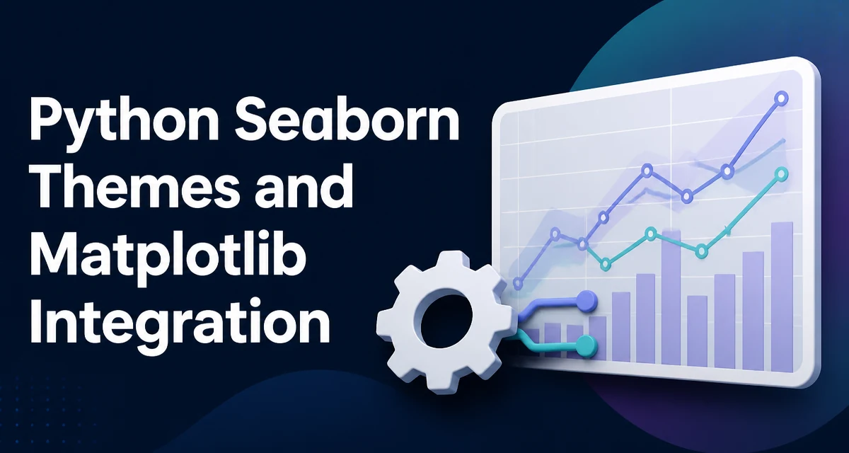
Python Seaborn Themes and Matplotlib Integration
Learn how Seaborn themes work with Matplotlib's rcParams, apply and customize them, and avoid common integration pitfalls.