Browse by Topic
Popular
Popular Posts
Latest
Latest Posts
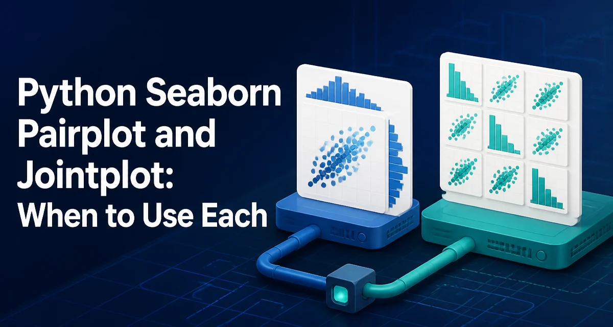
Python Seaborn Pairplot and Jointplot: When to Use Each
Learn how seaborn's pairplot and jointplot work, how to customize them, and when to use each for exploring relationships between numeric variables.
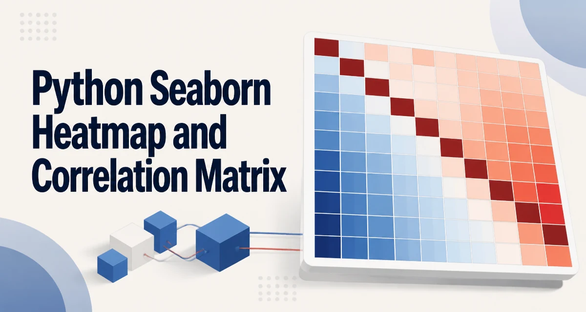
Python Seaborn Heatmap and Correlation Matrix
Use pandas to compute a correlation matrix and Seaborn to visualize it as a heatmap. Customize annotations and color scales, and handle large datasets efficiently.
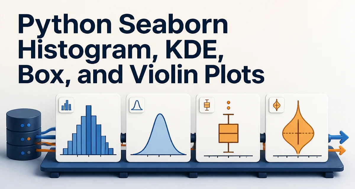
Python Seaborn Histogram, KDE, Box, and Violin Plots
python seaborn histogram kde box and violin plots: Learn to create and interpret seaborn histograms, KDE plots, box plots, and violin plots for effective distribution...
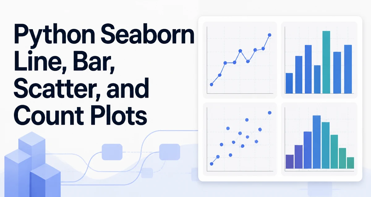
Python Seaborn Line, Bar, Scatter, and Count Plots
python seaborn line bar scatter and count plots: Learn to create line, bar, scatter, and count plots with seaborn, including syntax, parameters, and when to use each t...
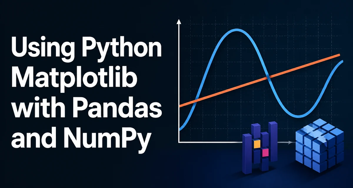
Using Python Matplotlib with Pandas and NumPy
python matplotlib with pandas and numpy: Learn how to combine matplotlib with pandas and numpy to create clean, customizable plots directly from DataFrames and arrays,...
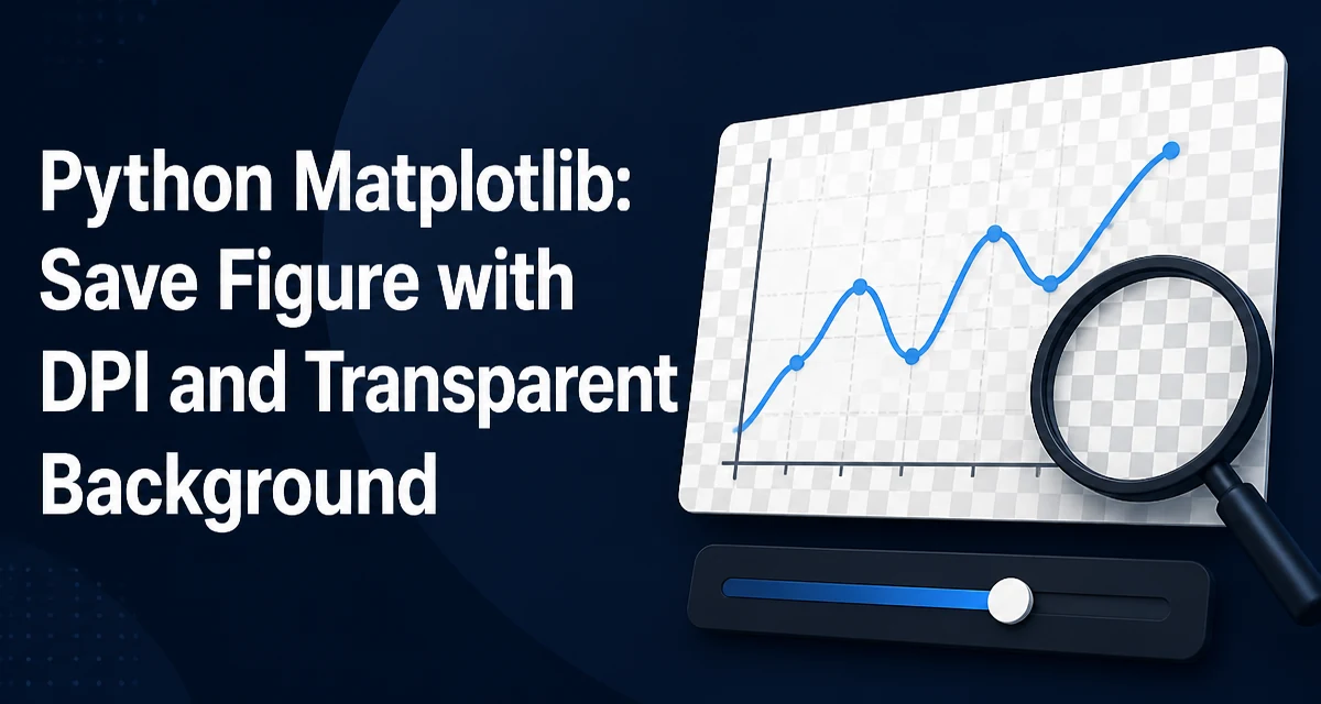
Python Matplotlib: Save Figure with DPI and Transparent Background
Learn how to control resolution and background transparency when saving Matplotlib figures. This guide covers savefig's dpi and transparent parameters, examples, and common pitfalls.
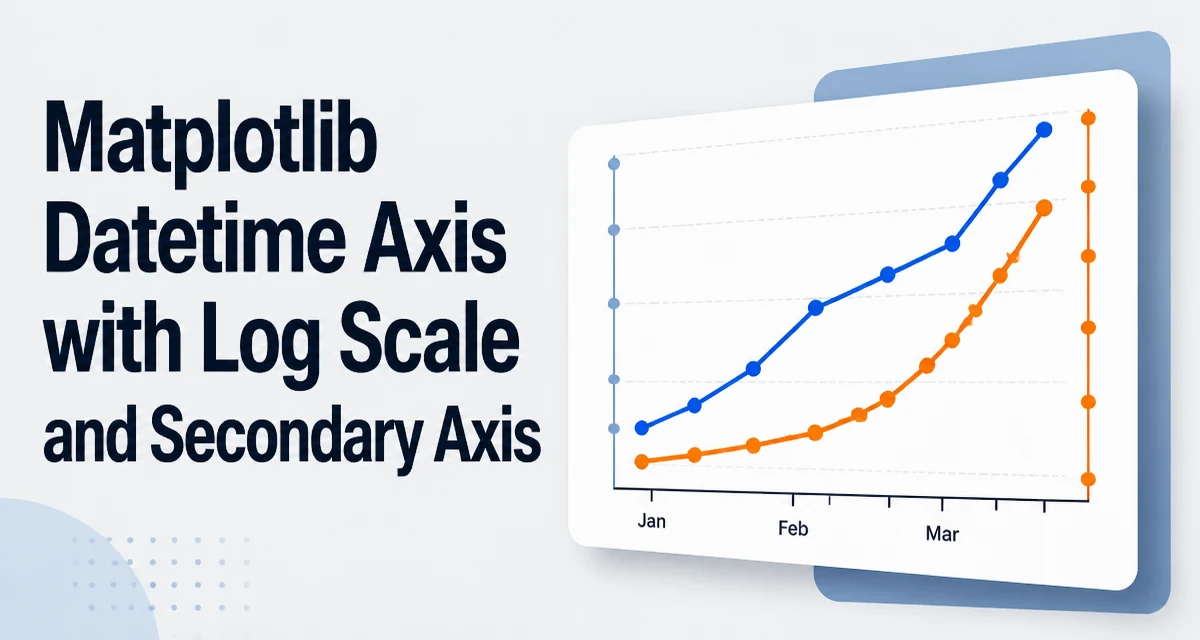
Matplotlib Datetime Axis with Log Scale and Secondary Axis
Convert Python datetimes to numeric values with `matplotlib.dates.date2num`, plot them on a log scale, and use a secondary axis for readable date labels. Includes examples for a secondary y-axis and common pitfalls.
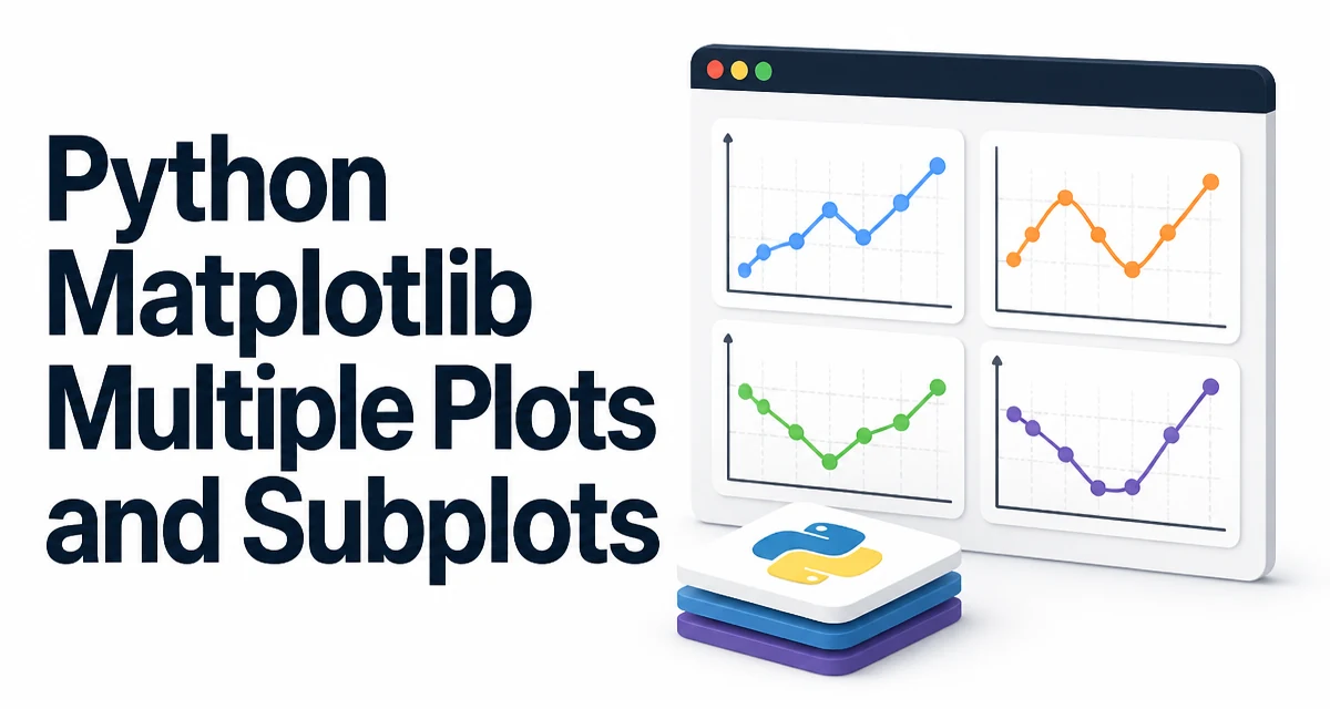
Python Matplotlib Multiple Plots and Subplots
python matplotlib multiple plots and subplots: Learn how to create multiple plots and subplots in Python Matplotlib using plt.subplots(), manage figure layout, share a...
Python Matplotlib: Tick Label Rotation, Text, and Annotations
Rotate Matplotlib tick labels with tick_params, set explicit tick positions, and add text or arrow annotations with ax.text() and ax.annotate().
Matplotlib Figure Size, Titles, Labels, Legends, and Grids
Learn how to control Matplotlib figure size, titles, axis labels, legends, and grids in Python. Includes practical code examples and layout guidance.